Cover story: Our Land in Colour: A History of Aotearoa New Zealand 1860 - 1960

Author:
Brendan Graham with Jock Phillips
Publisher:
HarperCollins New Zealand
ISBN:
9781775541929
Date published:
02 August 2023
Pages:
400
Format:
Hardback
RRP:
$54.99
Completely unscientifically and from a book buyer’s point-of-view, rather than a designer’s well- honed eye, each month, here at Kete, we judge books by their covers to come up with one we deem to be the most alluring. Then we hear from those who put it together to find out the story behind the cover.
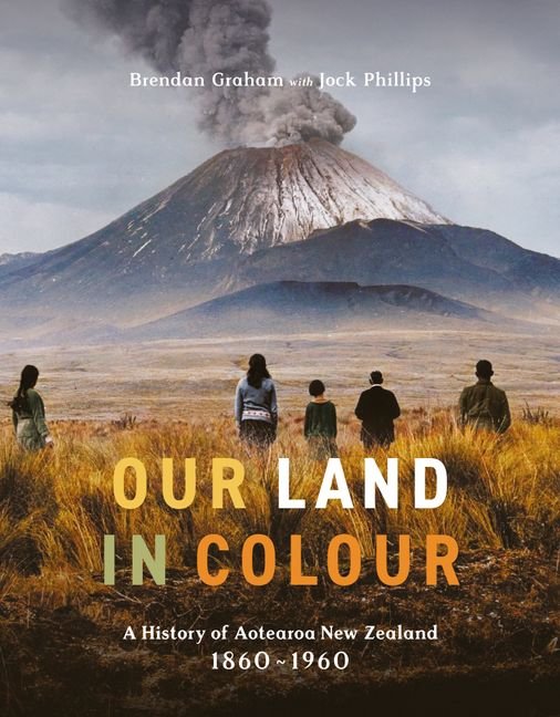
Looking back to August, it was Our Land in Colour that made the greatest impression. A history book like no other, it uses 200 photographs expertly colourised by Brendan Graham, with commentary from award-winning historian Jock Phillips, to tell a story of Aotearoa.
Restoring images never before seen in colour makes the past feel more present, more recognisible. As Graham writes it brings it ‘out of the shadows.’ The cover image, from 1926, features a group of onlookers – backs to the camera – watching Mt Ngāuruhoe erupt – as it has done some 70 times since 1839.
It’s an image which raises questions about these unknown onlookers, standing in the bleak Rangipō Desert, made of it all. Were they frightened? Why did they want to get a closer look? Surely, confronted by a volcanic eruption, the impulse is to run?
Here’s what designer Julia Murray and colourist Brendan Graham say about selecting the image for the cover and their thoughts on the finished product.

The original image. (Alexander Turnbull Library, 1/1016369G)
Designer Julia Murray:
Whose idea was it to use the image that was selected for the cover?
That image was among a few that the publisher had highlighted to try as a cover.
Was this image a clear ‘stand out’ or were there others that you considered?
I usually go through all the photography, trying a large pool of options that is slowly whittled down.
What was it about this one that appealed?
The selected cover photo was a strong contender from the start – the photo is beautiful and obviously an historic image by the subject matter which is important. Also the image was clear enough that the typography can work in conjunction with it. There were a few other front runners but this was the one that everyone agreed worked the best.
What did you have to do, as a designer, to make it work (in terms of selecting the right font, colours etc)?
For legibility reasons the font needed to be fairly bold and easy to read as it’s overlaying different shades and textures. I wanted the font to be classical in style so it didn’t jar with the photography. Choosing colours for the type that was sympathetic to the photo but also stood out was surprisingly difficult. It was a lot of trial and error.
Have you ever worked on a project like this before?
I’ve worked on a lot of books in my time, from all different genres, but this one was really special. I actually worked on this in conjunction with my husband, Steven Ranson, who is also an art director. We both knew this would be an amazing project to be a part of. When I first saw the photography I was blown away. Brendan has done such a superb job of colourising the photos. They’re really a work of art. As soon as I saw the photography I knew I’d love to work on it.
What were its challenges and, of course, its joys?
The challenge was to design it in a way that let the photography really be the star of the show. And do it in a way that is modern but echoes the historical feel. I kind of went down a rabbit hole with font research and I’m really pleased with the title font on the internal design. That font wasn’t one that would work on the cover though; the cover needed something bolder. The layout design needed to be flexible and let the photos sit in a way that didn't crop or interrupt them.
In what ways, if at all, do you think it’s changed the way you look at our history?
There’s something so wonderful about seeing historical photography in colour like this. It makes the past so much more relatable. It brings an empathy to the viewing that I don’t think you feel as greatly with black and white photography. It reels you in and confronts you.
How did you feel when you saw the finished product?
It’s always a lovely day when you get a book in the mail that you’ve worked on. It was so lovely to seeing this in the flesh. The print quality is beautiful and there’s a lovely heft to it! It’s pride of place on our coffee table.
We are told you should never judge a book by its cover, but are there books you have bought specifically because you were attracted by the cover?
I ALWAYS judge a book by its cover!
Colourist Brendan Graham:
What was it about this image that screamed – or whispered, perhaps – ‘I should be on the cover’ to you?
During the course of creating this book, I consistently pondered the question: ‘What image would work best as the cover?’ As the finish line came into view, I found myself deeply immersed in the book's content, almost as if I couldn't see the forest for the trees, so to speak.
Alex, the editor with whom I had collaborated closely throughout the project, and the designer, jointly proposed the cover design. This particular one had temporarily slipped from my memory.
However, when it was reintroduced, my response was an enthusiastic ‘Yes.’ It fit the cover so well and encapsulates the essence of the book's content.
Can you explain what you, as a colourist, does i.e. what is the process for selecting photos and then colouring them?
When I'm in the process of selection, I actively seek out images with both detailed features and a broad dynamic range. The more information embedded in a black and white image, the more flexibility I have to adjust its contrast, if necessary. It's crucial that the chosen image can convey a narrative, drawing in the viewer, even if they possess only a basic understanding of the subject. Such images have a higher chance of resonating with the audience. A powerful image should leave us inquisitive, sparking our desire to learn more. If you find yourself contemplating an image throughout the day, you know you've encountered something compelling.
In addition, I have a fondness for images that evoke nostalgia or a sense of quintessential Kiwi familiarity. This nostalgic connection is a more profound emotion than one might initially suspect; images that trigger such sentiments tend to leave a lasting mark on our minds. The final touch is that these images must radiate a truly Kiwi essence, ensuring they become genuinely iconic.
You wrote that sometimes images leave us with more questions than answers – was this the case with this cover image or did you discover a little more about it?
The questions that intrigue me are often found in the small details, in those tiny particulars for which I may never find an answer. In a particular image, I noticed what initially seemed to be a mark on the print but, upon closer inspection, revealed itself to be a small piece of litter or perhaps even a handkerchief caught by the wind. What exactly is it and how did it come to rest there? It may sound trivial but it's precisely these kinds of questions that spark my curiosity.
What were you hoping to communicate with this image?
My intent isn't always to have photos that look like they were taken yesterday; at times, I want to convey a particular atmosphere or let a specific era shine. In the case of this particular image, it exuded an archetypal quality, almost resembling a grand oil painting on canvas. I embraced that essence and ran with it, endeavouring to infuse the image with rich yet understated colours, enhancing the inherent grandeur with a touch of colour.
What do you think you learned about NZ history through your work on this book?
Nearly every day I spent working on the book, I discovered something new. Some of the stories I thought I knew about great New Zealanders, but I had never delved into them fully before. Right at the outset of this project, I had envisioned covering certain aspects of New Zealand, only to realise that there wasn't an abundance of information available. This, in turn, fuelled my desire to research further.
How did you feel when you saw the finished product?
Holding the first copy felt surreal. I had spent countless hours working on these images and even though I had already printed many of them individually, seeing them all together in book format created a unique sense of surrealness.
We are told you should never judge a book by its cover, but are there books you have bought specifically because you were attracted by the cover?
Cover art is absolutely crucial. It needs to instantly capture the potential reader's attention and encapsulate the entire story within a single image. I must admit, I'm a sucker for exceptional cover art and often find myself getting sidetracked when passing a bookstore, returning to work with a new book clutched in my hand.
